
Abstract
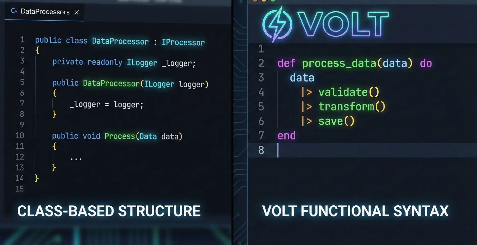
The WordPress Block Editor (Gutenberg) has matured into a comprehensive application development platform. In 2025, building custom blocks is no longer about hacking PHP; it is a standardized React development process. This chapter guides developers through the modern block toolchain, focusing on the block.json metadata specification, the useBlockProps hook, and the architecture of a block plugin.
The block.json Standard
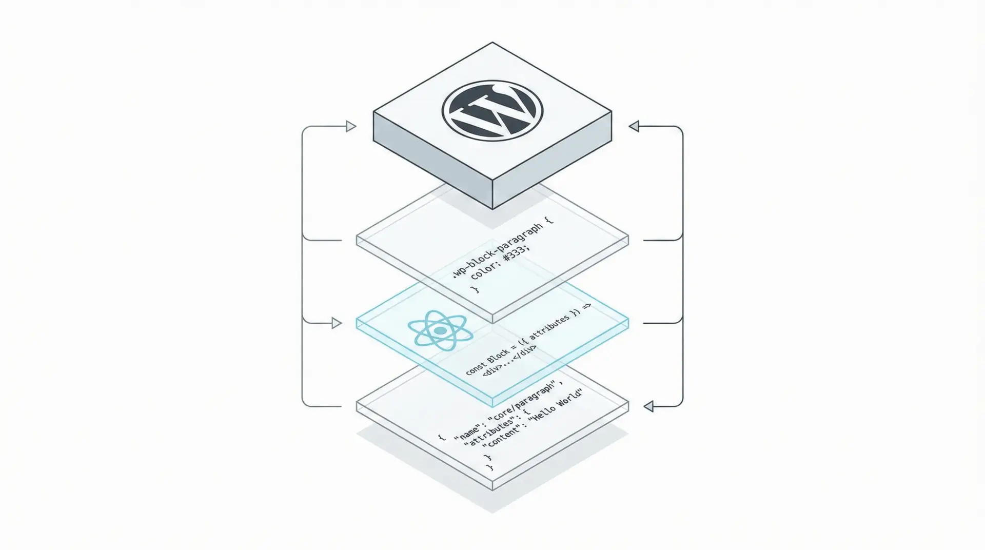
The foundation of a modern block is the block.json file. This JSON object serves as the single source of truth for the block’s metadata, defining its identity, attributes, and capabilities on both the server and client.28 Utilizing block.json allows WordPress to lazy-load the block’s assets (JavaScript and CSS) only when the block is actually present on a page, significantly improving frontend performance.
Key Configuration:
{
  "apiVersion": 3,
  "name": "my-plugin/feature-card",
  "title": "Feature Card",
  "category": "design",
  "attributes": {
    "title": { "type": "string", "source": "html", "selector": "h2" },
    "mediaId": { "type": "number", "default": 0 }
  },
  "supports": {
    "color": { "text": true, "background": true },
    "spacing": { "margin": true, "padding": true }
  },
  "editorScript": "file:./index.js",
  "style": "file:./style-index.css"
}
The supports object is particularly powerful. By simply declaring color: true, the block automatically gains the standard WordPress color picker controls in the inspector sidebar, preventing the need to write custom color handling logic.
The Edit Component
The edit.js file exports a React component that defines the block’s interface in the editor. It utilizes the useBlockProps hook to inject the necessary ARIA labels, class names, and event handlers that the editor requires to function.
Code Example: Interactive Editor UI
import { useBlockProps, RichText, MediaUpload } from '@wordpress/block-editor';
import { Button } from '@wordpress/components';

export default function Edit({ attributes, setAttributes }) {
  // Merges default block props with any custom styles
  const blockProps = useBlockProps();

  return (
    <div {...blockProps}>
      <MediaUpload
        onSelect={(media) => setAttributes({ mediaId: media.id, mediaUrl: media.url })}
        render={({ open }) => (
          <Button variant="secondary" onClick={open}>
            {attributes.mediaId? 'Change Image' : 'Upload Image'}
          </Button>
        )}
      />

      <RichText
        tagName="h2"
        value={attributes.title}
        onChange={(title) => setAttributes({ title })}
        placeholder="Feature Title..."
        allowedFormats={['core/bold', 'core/italic']}
      />
    </div>
  );
}
This component demonstrates the Data-Down, Actions-Up pattern. The attributes prop contains the current state, and setAttributes updates it. The RichText component is a controlled input that directly manipulates the block content.
The Save Component vs. Dynamic Blocks
For the frontend, developers have two choices:
- Static Rendering (save.js): The component returns pure HTML which is saved into the database. This is performant but rigid.
Dynamic Rendering (PHP): The save function returns null. The block’s HTML is generated on the server via a PHP render callback (render_callback in register_block_type). This is preferred for blocks that display changing data, like “Latest Posts”.